This interactive visualization adapted from NASA and the U.S. Geological Survey illustrates …
This interactive visualization adapted from NASA and the U.S. Geological Survey illustrates the concept of albedo, which is the measure of how much solar radiation is reflected from Earth's surface.
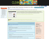
This color-coded map displays a progression of changing five-year average global surface …
This color-coded map displays a progression of changing five-year average global surface temperatures anomalies from 1880 through 2010. The final frame represents global temperature anomalies averaged from 2006 to 2010. The temperature anomalies are computed relative to the base period 1951-1980.
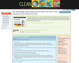
This NASA animation of the Five-Year Average Global Temperature Anomalies from 1881 …
This NASA animation of the Five-Year Average Global Temperature Anomalies from 1881 to 2009 shows how temperature anomalies have varied in the last 130 years. The color-coded map displays a long-term progression of changing global surface temperatures from 1881 to 2009. Dark red indicates the greatest warming and dark blue indicates the greatest cooling.
This NASA animation shows the levels of atmospheric carbon dioxide over different …
This NASA animation shows the levels of atmospheric carbon dioxide over different time scales. Viewers can compare the last 400,000 years, last 1000 years, and last 25 years. The data come from the Lake Vostok ice cores (400,000 BC to about 4000 BC), Law Dome ice cores (1010 AD to 1975 AD) and Mauna Loa observations (1980 to 2005).
This animated visualization was created for the planetarium film 'Dynamic Earth'. It …
This animated visualization was created for the planetarium film 'Dynamic Earth'. It illustrates the trail of energy that flows from atmospheric wind currents to ocean currents.
No restrictions on your remixing, redistributing, or making derivative works. Give credit to the author, as required.
Your remixing, redistributing, or making derivatives works comes with some restrictions, including how it is shared.
Your redistributing comes with some restrictions. Do not remix or make derivative works.
Most restrictive license type. Prohibits most uses, sharing, and any changes.
Copyrighted materials, available under Fair Use and the TEACH Act for US-based educators, or other custom arrangements. Go to the resource provider to see their individual restrictions.