- Number of visits 1
- Number of saves 1
- 0
Description
- Overview:
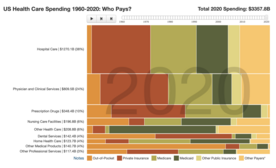
- This source is an infographic that allows the students to see the change in healthcare spending from 1960 through 2019. For an interactive activity I would urge you to ask the students to use the scroll bar and move the dial to each decade and make notes about the spending they see. After jotting down the data they see, they should create graphs to model the healthcare spending. The key takeaways the students should recieve is that as time has progressed, medicare, medicaid, and private insurance are the three main ways health care bills are paid. Attached below is supplemental material that gives an overview of health care spending and insurance costs in the U.S health care system.
- Subject:
- Health Science
- Level:
- High School
- Material Type:
- Activity/Lab
- Author:
- Anthony D'Acquisto
- Date Added:
- 07/20/2022
- License:
-
Public Domain Dedication

- Language:
- English
- Media Format:
- Interactive

Standards
Evaluations
No evaluations yet.
Comments